My proposal with a final word count of 1530.
Monday, 30 April 2012
Thursday, 26 April 2012
A Serene Sculpt
A good friend of mine has recently got into digital sculpting and he volunteered to do some free sculpting for me, of course i agreed to this and he quickly started work on Serenity, the main character for my project. He thought it would be a bit of a challenge since my style is so different to his but he didn't see this as a set back, more of a chance to improve his own scultping skills by experimenting with other peoples ideas. Although the sculpt isn't finished yet i am happy with the results so far and am enjoying this mini collaboration. Here a few screenshots he's taken so far so you can see how the sculpt is coming along.
Here's a link to his blog if you like what you see: Staurt's Blog
 |
| The concept for the sculpt, Serenity, my protagonist. |
Snapshots
As an opportunity to show how i can work with different types of media, i have decided to upload a few photos I've taken over the last few months, although there are not many of them, i like them all nonetheless.
This is a lucky photo of some of my pets. I managed to catch Anya as she looked right down the lens of the camera, simple but pretty darn adorable.
We have a habit of drawing faces on our eggs in our university house. This was one of those eggs. He was also my favourite. When the time came to finally cook him and i cracked his head open, and it cracked perfectly. He looks, confused and slightly deranged but mostly, he looks like he was betrayed...
Although i can't take credit for the actual graffiti, i found this piece on a garage door in Bristol, there was something about it i really liked, instead of the usual swear words and tags left by thugs, this graffiti is actually artistic and happy looking. Luckily i was there to get a quick snap of it.
This is my childhood friend getting married, amongst the crowd of happy snappers trying to get a good angle i managed to take this picture which I'm really pleased with, I added the sepia effect later but i think it really makes the photo better, there is an now an old fashioned charm to the photo that wasn't there before.
Well there we go, they were the few photos I've taken recently, hope you liked them. I'll leave you with one final photo that i really liked, at first i thought it was a little childish, but what the hell, this is my blog and i find it funny!
The Pokémon Story - A Look into the Games Industry
This post will be dedicated to finding out about the games industry and will focus heavily on the success of the Pokémon series. Before I start actually talking about the franchises success, let me just explain to you what exactly Pokémon is about, just in case you've been living under a rock for the past decade.
Pokémon takes place in a fictional universe that is very similar to our own with the main difference being that humans share the world with not only animals, but other creatures called Pokémon. These creatures can vary in shape and size and they all have a type. So for example, a Pokémon that lives in the sea will probably be a water type, the same as a Pokémon that lives underground is probably a ground type. All Pokémon have different names as well, to help differentiate the 500+ creatures and make them more memorable.
These creatures can be captured and tamed with the help of a Pokéball - a contraption that catches a weakened Pokémon. These Pokémon can then be used to battle other Pokémon, although this sounds barbaric and very similar to cock or dog fighting, the Pokémon enjoy the activity and it is regarded as a competitive sport in the Pokémon universe. When a child turns ten in this universe, they are given the opportunity to become a Pokémon trainer and travel the world in search of Pokémon to train.
The Pokémon universe was created by Satoshi Tajiri in 1996, who was an avid insect collector as a child, this gave him the idea for Pokémon. Satoshi Tajiri already owned a game development company with his friend Ken Sugimori called Game Freak and together they designed and created 151 different creatures for a role playing Game Boy game called Pocket Monsters (Pokémon). These original games came in two colours, red and green, distinctly different by the Pokémon you could catch in each. This meant if you wanted to catch all 151 Pokémon you would have to trade with your friends. The player was given the incentive to 'become a Pokémon master' by training and evolving their Pokémon into stronger Pokémon and beating 8 Pokémon gyms, which each housed a particularly strong opponent and then eventually battling the elite four, who were regarded as the worlds finest Pokémon trainers.
Instantly the game was a success and two newer, more defined versions of the game were asked for by Nintendo that would be fit for sales in the rest of the world. Thus Pokémon Red and Blue were created.
Pokémon Red and Blue
These games were praised by critics and received mostly positive reviews. The Games were also ranked third in a countdown of best games for the Game Boy. The success of the game was seen as the innovative idea and addicting game play. The multiplayer aspects of the game that included battling and trading Pokémon was also praised and proved to be very popular with children who would battle their school friends. The success of the games was also attributed to the unique appearances of the Pokémon and the chance to define who you were by the Pokémon you chose. It gave children a chance to express themselves and gave them a feeling of individualism. Soon an anime and manga series were being made and a feature length film was in the works. After such a success, it was inevitable that the series was going to continue, and it did, with the release of Pokémon Gold and Silver.
Pokémon Gold and Silver
Gold and Silver were released in 1999 and were highly anticipated games that had a high bar to beat, but the fans were not disappointed with this second instalment. Another 100+ Pokémon were introduced, some evolutions of older Pokémon, some prevolutions of Pokémon, but mostly brand new species. as well as new Pokémon, the game took place in a different region to the first, the 'Johto' region, before the second installment of games the first games region didn't have a name, but it was referred to as the 'Kanto' region from Gold and Silver onwards.
Pokémon Gold and Silver provided a lot of new features for players, for example the game was now in colour as it had been made for Game Boy Colour, the game featured a day and night system with certain Pokémon only appearing at certain times of day, a radio and mobile phone system were incorporated so you could listen to in game music whenever you liked and call up beaten trainers for rematches, held items were introduced to give you the edge oer you opponent in battle, a wider variety of pokéballs became available and the chance of encountering ultra rare 'shiny' Pokémon was introduced. Reception of the game was very positive and sales beat Pokémon Yellow's (the collector's edition of Pokémon Read and Blue) record sales. And so, another instalment was planned.
Pokémon Ruby and Sapphire
The third generation of Pokémon, Ruby and Sapphire were released in 2002/3 and were set in the Hoenn region. This region was a particular favourite of mine which is why it surprises me that these games were the first received with a more negative reception. Fans were angered that they could not recover their Pokémon who they had become attached to from their Red, Blue, Crystal and Gold games, this was due to Ruby and Sapphire being switched over to Nintendo's newer console the Game Boy Advance which didn't have the ability to let the newer and older games interact with each other. However, the games received positive reviews and continued on in the list of Pokémon successes, becoming Game Boy Advance's biggest selling games. Nintendo then began planning the next Pokémon instalment.
Pokémon Diamon and Pearl
Diamond and Pearl were released in 2006 and welcomed players to the Sinnoh region. This game was more risky than others before in terms on sales in the west as most children who had grown up with Pokémon were now young adults and there were fears that not as many people would buy the games. However, these games were also big successes and were praised by critics for the use of the dual screen functions of the Nintendo DS, the newest console from Nintendo. The bottom screen could run applications found in game that ranged from a stop watch to a Pokémon happiness reader.
However, some reviewers felt that the series was getting old and running out of ideas, and although the game play was still engaging, the story was lacking. Despite this Diamond and Pearl were the best selling opening week Pokémon games before Black and White. After the success of this game and wanting to improve on the game's story, another generation was announced.
Pokémon Black and White
Black and White were released in 2010 and take place in the Unova region, so far they are the most recently released games. These games include a much bigger more interesting story than the other games and so far is the only game that gets a sequel - Pokémon Black and White 2. This was probably a response to the critics negative comments on previous games lack of story, this change in direction is refreshing to see as the company has actually listened to people's opinions and changed. There are countless game franchises that refused to adapt and are now non existent. Black ad white brought a new battle system into play, the triple battle, along with an extra 150 Pokémon. It also has a lot of hours to offer as the story continues after the completion of the elite four, so much so that getting to the elite four is only half of the region, the other half contains much more.
Black and White was created to look much more urban than previous games, the cities actually looked like cities and were full of people, there were bridges that with cars going past, skyscrapers and modern architecture. This is because the Unova region isn't set in Japan like the previous games, it is set in New York. This was because these games wanted to include a different example of living, multi-ethnic groups and a different examples of communities. It also answered the question many fans pondered which was what is the rest of the world like and did they even have Pokémon. Critics praised this game and it received higher rating than previous games, the story was engaging and the Nintendo DS was being pushed to its limits graphic wise, it is interesting to note that this is the first game in the series to be on the same console as its predecessor Diamond and Pearl, however, the graphics were greatly improved in Black and White and the games took advantage of the current 3D boom and included many three dimensional structures such as bridges and harbours.
The sales of the Pokémon series so far are as follows:
Red/Green/Blue: 20.08 million copies
Gold/Silver: 14.51 million copies
Ruby/Sapphire: 13 million copies
Diamond/Pearl: 14.77 million copies
Black/White: Undetermined
These sales figures alone are astonishing but when you take into consideration the follow up games, the collectors editions and the spin off games the sales are over 200 million copies, and that figure rises everyday. Pokémon is the only behind Mario in the total amount of games sold ever and i hope one day it does overtake. Mario always looked so smug.
The Pokémon series is one of the biggest success stories known to not only the gaming world but the media world in general. A small idea sparked a huge trend, inspiring and captivating millions of people around the world. Even after ten years the series is going stronger than ever and expected to continue far into the future. Although original fans may still only love the original 151 Pokémon, new younger fans have grown up with newer generations and so the newer generations are enjoyed by roughly the same audience as the first generation. Game Freak has taken on board criticism and adapted to a new style of Pokémon game that not only promises us the same fun we have come to expect from a Pokémon game but also gives us a meaty story to bite into.
The Pokémon series has always really inspired me and the story of how such a simple idea snowballed has always fascinated me. Although i understand it is foolish to expect the same results from your own idea, you can still hope that it will achieve just a fraction of the success that the Pokémon series has enjoyed. I think that Pokémon is timeless and ten years down the line children and adults alike will be enjoying Pokémon games, and maybe even a few decades after that too, who knows?
Pokémon takes place in a fictional universe that is very similar to our own with the main difference being that humans share the world with not only animals, but other creatures called Pokémon. These creatures can vary in shape and size and they all have a type. So for example, a Pokémon that lives in the sea will probably be a water type, the same as a Pokémon that lives underground is probably a ground type. All Pokémon have different names as well, to help differentiate the 500+ creatures and make them more memorable.
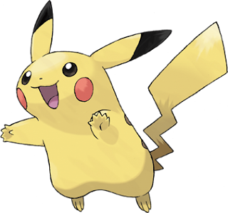 |
| Pikachu, the mascot of the Pokémon franchise |
The Pokémon universe was created by Satoshi Tajiri in 1996, who was an avid insect collector as a child, this gave him the idea for Pokémon. Satoshi Tajiri already owned a game development company with his friend Ken Sugimori called Game Freak and together they designed and created 151 different creatures for a role playing Game Boy game called Pocket Monsters (Pokémon). These original games came in two colours, red and green, distinctly different by the Pokémon you could catch in each. This meant if you wanted to catch all 151 Pokémon you would have to trade with your friends. The player was given the incentive to 'become a Pokémon master' by training and evolving their Pokémon into stronger Pokémon and beating 8 Pokémon gyms, which each housed a particularly strong opponent and then eventually battling the elite four, who were regarded as the worlds finest Pokémon trainers.
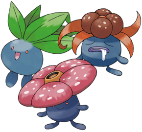 |
| An example of a Pokémon's evolutionary line |
Pokémon Red and Blue
These games were praised by critics and received mostly positive reviews. The Games were also ranked third in a countdown of best games for the Game Boy. The success of the game was seen as the innovative idea and addicting game play. The multiplayer aspects of the game that included battling and trading Pokémon was also praised and proved to be very popular with children who would battle their school friends. The success of the games was also attributed to the unique appearances of the Pokémon and the chance to define who you were by the Pokémon you chose. It gave children a chance to express themselves and gave them a feeling of individualism. Soon an anime and manga series were being made and a feature length film was in the works. After such a success, it was inevitable that the series was going to continue, and it did, with the release of Pokémon Gold and Silver.
 |
| Mew, the last of the 151 original Pokémon |
Gold and Silver were released in 1999 and were highly anticipated games that had a high bar to beat, but the fans were not disappointed with this second instalment. Another 100+ Pokémon were introduced, some evolutions of older Pokémon, some prevolutions of Pokémon, but mostly brand new species. as well as new Pokémon, the game took place in a different region to the first, the 'Johto' region, before the second installment of games the first games region didn't have a name, but it was referred to as the 'Kanto' region from Gold and Silver onwards.
 |
| Magcargo, a second generation Pokémon |
Pokémon Ruby and Sapphire
The third generation of Pokémon, Ruby and Sapphire were released in 2002/3 and were set in the Hoenn region. This region was a particular favourite of mine which is why it surprises me that these games were the first received with a more negative reception. Fans were angered that they could not recover their Pokémon who they had become attached to from their Red, Blue, Crystal and Gold games, this was due to Ruby and Sapphire being switched over to Nintendo's newer console the Game Boy Advance which didn't have the ability to let the newer and older games interact with each other. However, the games received positive reviews and continued on in the list of Pokémon successes, becoming Game Boy Advance's biggest selling games. Nintendo then began planning the next Pokémon instalment.
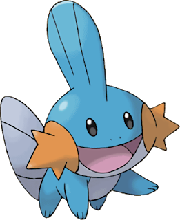 |
| Mudkip, a third generation Pokémon |
Diamond and Pearl were released in 2006 and welcomed players to the Sinnoh region. This game was more risky than others before in terms on sales in the west as most children who had grown up with Pokémon were now young adults and there were fears that not as many people would buy the games. However, these games were also big successes and were praised by critics for the use of the dual screen functions of the Nintendo DS, the newest console from Nintendo. The bottom screen could run applications found in game that ranged from a stop watch to a Pokémon happiness reader.
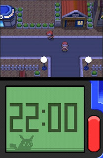 |
| The bottom screen, currently set on the time application |
Pokémon Black and White
Black and White were released in 2010 and take place in the Unova region, so far they are the most recently released games. These games include a much bigger more interesting story than the other games and so far is the only game that gets a sequel - Pokémon Black and White 2. This was probably a response to the critics negative comments on previous games lack of story, this change in direction is refreshing to see as the company has actually listened to people's opinions and changed. There are countless game franchises that refused to adapt and are now non existent. Black ad white brought a new battle system into play, the triple battle, along with an extra 150 Pokémon. It also has a lot of hours to offer as the story continues after the completion of the elite four, so much so that getting to the elite four is only half of the region, the other half contains much more.
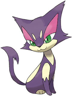 |
| Purrloin, a fifth generation Pokémon |
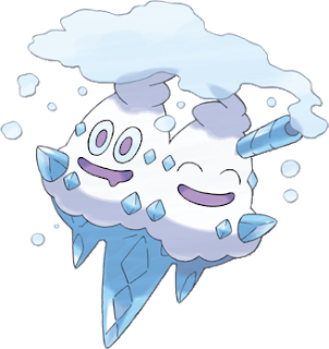 |
| Vanilluxe, a fifth generation Pokémon |
Red/Green/Blue: 20.08 million copies
Gold/Silver: 14.51 million copies
Ruby/Sapphire: 13 million copies
Diamond/Pearl: 14.77 million copies
Black/White: Undetermined
These sales figures alone are astonishing but when you take into consideration the follow up games, the collectors editions and the spin off games the sales are over 200 million copies, and that figure rises everyday. Pokémon is the only behind Mario in the total amount of games sold ever and i hope one day it does overtake. Mario always looked so smug.
 |
| Politoed, a second generation Pokémon |
 |
| Ralts, my favourite Pokémon |
Tuesday, 24 April 2012
Do the Mess Around
Although I've already posted a few images that i have completed with the aid of the digital painting programme Corel Painter, i thought it would be nice to post a couple of mess arounds that i did that i thought were particularly effective and nice to look at. The images are very simple and easy to create, just painting a few different shades of colour on a blank canvas and then using a blending tool to creating cool swirling patterns. I did this until i was happy with the look of the painting and like i said, the results are quite pretty.
I think the red, purple and green patterns look the nicest but i felt it would be a shame for the pink and blue ones to waste away on my memory stick before getting looked at. Hope you enjoy looking at them as much as i enjoyed making them.
I think the red, purple and green patterns look the nicest but i felt it would be a shame for the pink and blue ones to waste away on my memory stick before getting looked at. Hope you enjoy looking at them as much as i enjoyed making them.
I Can - Illustration Opportunity
To further my personal development, i decided to help a friend out with one of her assignments. She is on a child care related course and works with children with a wide variety of special needs. Her assignment was to create a book for these children with fun illustrations and a simple storyline to keep their attention. Jenny (my friend's name) decided to focus on the positive and create a book expressing that special need children can do a lot of things other children can do, entitled 'I Can'.
We sat down one afternoon and discussed what exactly she wanted me to do. I was instructed to draw pictures depicting four activities, painting, playing football, singing and playing dress up being done by a group of special need children and average children. Here are some rough ideas for the style we came up with.
Originally we decided on the second design, a cutesy depiction of the children. However, this proved to be difficult as only certain characters worked in this style. So with Jenny's permission I tweaked the designs to show a wider range of ages amongst the children which i feel worked much better. Here are the final designs:
Although i had some trouble with the digital art programme i was using (Corel Painter), i think the pictures turned out OK. I was unable to alter the pictures as much as i wanted due to my inexperience with the programme but i am learning more on it everyday so soon enough i should be much better.
Overall, i am happy with the outcome but the whole project proved to be pretty stressful due to the new programme confusion combined with my hand's frustration at not drawing in the same style i usually draw in. However, Jenny was happy with my contribution to her project and i was happy i could help her and she reassured me that aesthetically her project stood out from the rest, which i was very pleased about. (Good luck with your grade Jenny!)
Monday, 23 April 2012
Final Designs Plans + Colour
After drawing countless dresses for my main character I have finally come up with her ten different looks, although I'll need to experiment with colour on a few of them, i am pretty pleased with how they already look.
I was happy with all of these dresses apart from the first one which faded into the background compared to the other dresses. I realised this was because it didn't have any stand out features to it and so i redesigned it.
I think this dress stand out more than the previous one and looks better too, I realise it is only in rough though so expect digital designs soon.
I'm going to choose three to four designs and take them through to Corel Painter to spruce them up a bit. I haven't decided exactly which four or so designs i want to do this with yet, but i have picked one, the nautical sailor dress with the deadly anchor. Here is a sketch of her outfit/ weapon/ hair clip.
After a few play arounds in painter i created a mock up of what colours would be used on her. Although i may still change a couple of things with her, i am fairly happy with how the plan turned out, i think it really brings that nautical feel to the dress and since it will be worn in a sea themed level, it has achieved its goal.
I decided to then use this design in a rough plan for what my finished pieces will look like.
I am very happy with this plan, i think in the finished pieces it will all come together to deliver a show of various dresses that will be easily recognisable and easy to place if the environmental hint behind the dress does its job. I am particularly fond of the watercolour effect i used with the help of Corel Painter. I think i will use this effect on the finished pieces as looks really natural.
Eager to see what the other dresses would look like in colour, i decided to have a go at them quickly and i really like how the colours from my mind are suddenly in the design, so everyone can see the colours of these dresses i pictured in my head when i designed them.
The ice-cream dress on the far right on the first image, which had been fairly un-noticed up until this colouring point suddenly became more popular with people when i asked them their opinions on it, this was the same with the tulip coloured tulip dress second from the left. However, the top middle dress - supposedly representing the 70s was criticised for not being 70s enough, which is something i will have to work on.
Another dress i wanted a second opinion on was the woolly coat dress worn in the ice zone. I wasn't sure on colours so i drew six variations and asked people which their favourite was. I had personally always imagined the coat to be pink and brown, the design second from the right.
After asking a couple of my friends it was clear that no-one particularly liked the red, green or black dress - all being too stereotypically christmasy . The yellow dress was well received but the blue and pink dress proved to be the favourites. This reassured me to go with my gut and pick the pink one, however, i will keep the blue one in mind if i decided against the pink.
A few other plans i have been working on are the style of the weapons, i wanted them to all have something that made them special, so a sword isn't just a sword, it may have something quirky about it. Then my friend noticed that the battle axe looked a little bit like a broken heart and so i decided to play around with the idea and here are my results with the axe.
I am happy with these designs and will be using the one which the character is holding. It looks like a broken heart which is perfect for this game, if i can give the other weapons something quirky like this it would be a nice detail to have.
Lastly, i have been working on a way to hint about the environment the dress would be in so the viewer can get some sort of idea of where the dress would be and how it would fit in with the surroundings. I solution is came up with is a circle with an inner circle, with a basic picture inside that will hopefully give an idea of the environment, for example, the sea level would have a wave in a circle, this is viewable in the rough plan a few pictures up. Here are the environmental seals I designed for each environment.
I think these will work well to give an idea of the environment as they are simple yet effective. Some need some tweaking, for example i think the time seal looks too simple and boring and the swamp and jungle seals look too similar. However, i am very pleased with this idea and hopefully it will work out well.
Subscribe to:
Comments (Atom)


