For this assignment we had to create a promotional poster and trailer for a game. We were given a list of game titles and styles from which we could only pick one. These included a new Mario game in which the objective was to surf the universe, a new Gears of War styled game called WarBosses made by Epic Games and a murder mystery game called Ladykills in which you play a detective on the hunt for a female killing murderer.
Originally i chose LadyKills as the idea appealed to me and i thought it would give me a lot of freedom in designing the characters and story. However, i soon found out that the whole story had already been designed for the game and there were just too many elements that needed to be covered and incorporated in the trailer.
After deciding against LadyKills,I started to look at the other options, the Mario and Warbosses games particularly appealed to me. I decided not to go for the Mario option though as i was worried Nintendo would sue my ass if i ever exhibited my work which would be designed around Mario. So Warbosses it was. Now, i have a confession to make: I've never played Gears of War, the game that WarBosses is supposed to resemble and after doing some research it seemed to be just a simple shooter set on another planet with men in over sized armour suits and gigantic weapons.
After attempting to draw several men and women in this style i got bored. I was uninspired and wanted to quit, but after finding out the brief was just a starting point and that we could expand on it as much as we wanted, i suddenly started enjoying the assignment again. Instead of having huge hulking men in the game, i included two women, who are always grossly underrepresented in these games and a relatively slim but physically fit male.
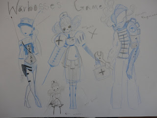 |
| Ideas for characters |
 |
| Communications/ Sniper |
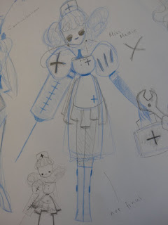 |
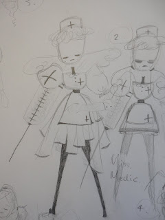
| Old Medic design with new design next to feet |
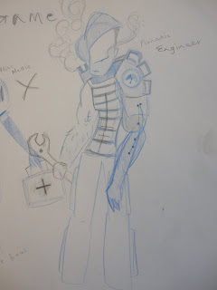 |
| French Engineer |
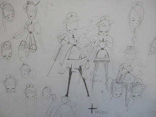 |
| Developing the medic |
 |
| Miss Medic |
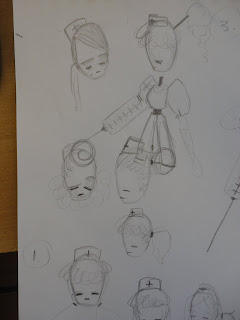 |
Her hair didn't match her strict personality so i put her hair up
This shows she is more in control. |
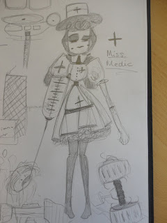 |
| Final design |
I decided relatively early on that the game would include and engineer and a communications type character. I did more research and discovered Brink, a newly released game in which the player gets to choose a class, this seemed similar to the direction in which my design was going. I researched brink and discovered there was a medic class available. A medic class would fit well into my design alongside the engineer and tech girl and so she joined the group.
.Here are the character bios with information about their past and personality:
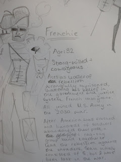 |
| Frenchie |
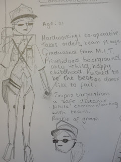 |
| Communications- i messed up her head, the bottom head is correct |
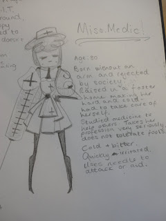 |
| Miss Medic |
Coming up with a story for the trailer didn't take too long. Research indicated that most shooters had a short amount of story at the beginning of their trailer followed by a heavy action packed sequence. I decided to follow in my predecessor's footsteps. Here is what i came up with and how it looked when finished.
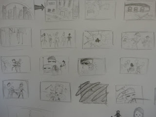 |
| Initial plan, this was way too long |
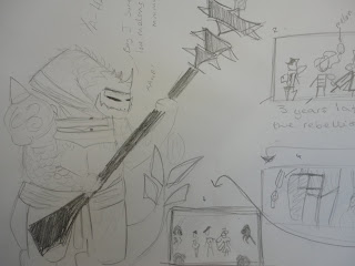 |
| More of initial plan... plus the bad guy :D |
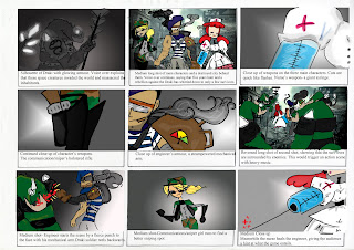 |
| Final Storyboard Part 1 |
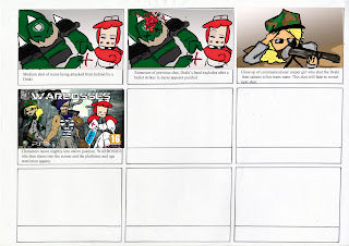 |
| Final Storyboard Part 2 |
Finally i did my poster, which i am really pleased with. This is the first proper project i have done in photoshop and i think it turned out very well! Originally i decided to do three posters, one poster focusing on each character's weapons and armour with different coloured squares in the background. The Engineer would have blue squares, the nurse would have purple and the sniper would have green. However, due to time constraints i decided it would be impossible and i should just focus on one character. I felt like my nurse was the strongest character, she was gritty, had an interesting back story, a bad-ass weapon and is generally the most appealing character to look at. Plus with her hair in pig tails she totally looks like a demented Nurse Joy from the Pokemon franchise, all the more reason for her to be my poster child!
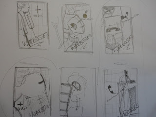 |
| Initial poster designs, i went for the one in the left corner |
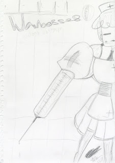 |
| Sketched image |
Here was the rough poster i sketched out, you can see my plans to include a square pattern in the background and the basic positioning of the nurse. Her proportions here are off by a lot but like i said, it was only a plan. Anyway, i scanned this in and started to add a background and colour it in... next time i looked at my clock it was bed time. This is what I'd produced at the end of day one:
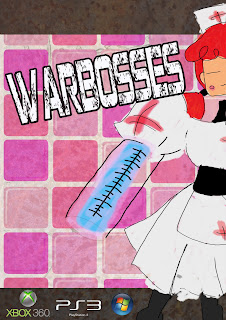 |
| After a day of work |
I was really excited with how this poster was turning out, photoshop started to work with me instead of wanting to ruin my work and i actually started to enjoy using the programme. Lots of things still needed to be sorted though, her dress was a mess, one leg was in an awkward place her syringe and face weren't finished. So the next day i got to work and... Ta da!
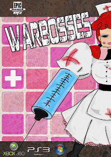 |
| After two days of work |
This is my final image. Like i said I'm really happy with how it turned out. Although i need to practice shading and blending a little more, i think it looks pretty cool, it definitely turned out better than i expected. I think this is probably my one of my favourite assignments of the year, even if we only had a week to do it in it's been really fun and educational. If i was to do this assignment again, i think i would want more time so i could do all three posters, which i will probably do over summer instead and maybe do something else to the nurse's face... something is slightly off about it- but nothing major. Overall this was a very enjoyable task, i only wish we had had more like this during the first year instead of so many animation tasks, but hopefully next year we'll get more assignments like this! Anyway, off to practice even more over summer, SEE YA!


No comments:
Post a Comment